Microsoft's Internet Explorer 7 is a great design improvement on earlier efforts and, whilst I still prefer Firefox, there are some useful new features like tabbed browsing (which Firefox has had for ages) and a simple zoom feature (which Firefox doesn't have) that narrow the gap between the two. It does look a bit different, though, to its predecessor, and default installations may hide some of the things that you have been familiar with. So here's a quick guide to displaying some toolbars and what some of the new buttons do.
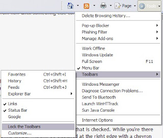 The first thing you may want to do is get the Menu bar back. Click on the Tools button and select Menu bar.
You may find that you cannot move any of the toolbars. Under Tools, click on Toolbars and then on Lock the Toolbars if that is checked. While you're there you can restore a Links toolbar by clicking on that entry.
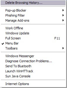
If the toolbars are locked the Links toolbar will only be displayed at the right edge with a chevron to click to access the links themselves. Unlocking will allow you to drag the Links toolbar across to the left to display as many link names as will fit which is usually more useful.
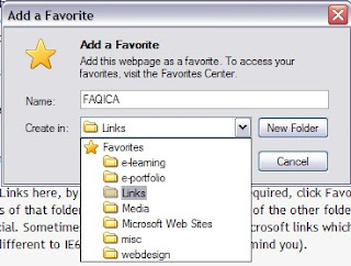
To add Links here, by the way, you go to the page required, click Favourites Add to Favourites and then select the Links folder to store them in. The contents of that folder are what get displayed. None of the other folders, or just Favourites generally, will feature in a bar like that, just Links which is a bit special. Sometimes that folder is stuffed with Microsoft links which you really don't need. Right click on these and delete them. No big loss. (None of this is different to IE6 or previous but thought I'd remind you).
Links and menu bar restored and now movable, you can play with some of the new toys.
The big new thing is the little square button, or tab, to the right of the one with the open page name. Click on that and you get a new window, probably with a helpful note from Microsoft on the subject. Put an address in the address bar and that will appear - but the other page doesn't disappear as it used to. It stays on its tab. You can have lots of tabs open as each time you open a new one a little square tab appears to its right (although that can be changed if you really want).

If you do have several tabs then try the four square button to the left of the row of tabs. Nice, isn't it? You get an attractive but maybe only marginally useful set of mini pages laid out on the page. Some people really like this and it does have an initial Wow factor, I suppose.
Links and menu bar restored and now movable, you can play with some of the new toys.

The big new thing is the little square button, or tab, to the right of the one with the open page name. Click on that and you get a new window, probably with a helpful note from Microsoft on the subject. Put an address in the address bar and that will appear - but the other page doesn't disappear as it used to. It stays on its tab. You can have lots of tabs open as each time you open a new one a little square tab appears to its right (although that can be changed if you really want).

If you do have several tabs then try the four square button to the left of the row of tabs. Nice, isn't it? You get an attractive but maybe only marginally useful set of mini pages laid out on the page. Some people really like this and it does have an initial Wow factor, I suppose.
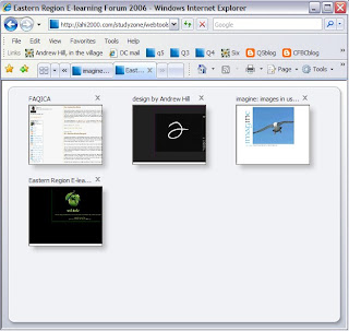
Top right is the built in search which Microsoft, being Microsoft, set to their Microsoft Live search facility. You'll want Google, or one of many others maybe. Click on the little arrow next to the magnifying glass and then on Find more providers.
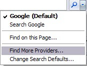
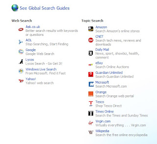
This takes you to a web page featuring a range of search engines and you simply choose the ones you want to add and then set the one you like best as your default.

Bottom right is a nice zoom tool. It works simply and most effectively and will be a boon to those who find text too small or just want to get a closer look.
Nothing in these notes will be new to the experts out there but they may help those to whom it all looked a bit confusing. I'll write about some of the more advanced tweaks later.
Images to follow for this post.
No comments:
Post a Comment