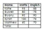
The simplest way to use both the formulae and charts is to put your data in a table. With a bit of care about how you set it out, and make sure you don't leave any blank rows or columns, the steps below will guide you through the process for doing some column totals, sorting the data into a different order and displaying it as a bar chart.
1 Insert a table
2 Put some headings in top row
3 Enter your data (tip: use the tab key to move which will also add rows if necessary)
4 Add an extra row for totals
5 If it’s not already showing, get the Tables and Borders toolbar, View>Toolbars>Tables and Borders or click the Tables and Borders icon on the main menu bar.
6 Click in the cell where you want the numbers above totalled and then click on the Σ key on the T&B toolbar
7 Repeat as necessary for other columns (check that it looks about right!)
8 To sort data in A-Z or 1,2,3 order of the first column, highlight what you want to re-arrange, including all the columns but not the headings or totals
9 Press the AZ or ZA button on the T&B toolbar
10 To sort in order for another column, eg by Maths results, you need to use Table>Sort and choose what you want in the window that opens. Again, it’s usually necessary to highlight all the data you want sorted (as in the previous example)
11 To make a chart, highlight the data to be included in the chart. In this case that will include the headings this time but not the totals.
12 If there isn’t an Insert Chart icon on the toolbar, use Insert>Picture>Chart
13 The default chart is a 3D column chart which will often be what you want
14 Use the corner handle to drag it out as necessary. To move it down, click on the chart, press the left arrow key and then enter to make new lines above it.
15 Enter a heading to describe what the chart shows
16 to edit the chart, double click on it. A data table will appear and you can also change almost every part of the chart.
17 If you wish to change the order of things displayed in the chart you have to re-arrange them in the datasheet that opens, not the original table. (If you do change the original table you will need to make a new chart as there is no link between the table and the chart in Word.)
18 It is usually a good idea to have labels on the axes to say what the units or categories are – there aren’t any in this example.
Note: Microsoft must have some deal with printing ink suppliers because all their default charts, and those in Excel, have grey shaded backgrounds. Totally unecessary - indeed, they make what can be a boring subject for some look even more tedious! Get rid of them. It's called the plot area and, once selected, can be changed. No fill is a good bet or, if you must have a background, you can choose from almost anything you want, including pictures. There are some more notes of that here.


No comments:
Post a Comment