There are probably a hundred other things I should be doing this evening but I am so pleased about what I can do with Zoho Creator that I just have to tell someone.
Forms on the web. Things that collect information. Things that people can type into on a web page and hit a button and you get the data a few seconds later. Now all you PHP geeks can stop reading but those of you who, like me, have no clue about PHP, don't have MySQL or other strange sets of initials on their web server and especially those who haven't the foggiest whether they do, but can copy and paste some html code into a web page or a web log should read on . . .
I have used CoffeeCup's Form Builder to create some data gathering forms on some sites but two things almost brought me to my knees. The first was that many clients don't have hosting for their web sites that has all the extra bits that can handle forms (and didn't want to pay the not inconsiderable sums demanded to get it). The second was that for those who had (or did) the flaming thing didn't work. Eventually I discovered that an extra line of PHP code was needed to make it work on at least one well-known host. It wasn't the sort of code that comes naturally, with odd expressions, essential spaces and e-mail references that were enough to confuse a giraffe in a forest. Still more communication proved necessary to persuade the host to make the mail address work too. However, at the time, it was the best I could do and it worked. I just dreaded the client asking me to change it one day!
Now I've discovered what Zoho Creator can do. It is amazingly simple. There are ready-made examples available. You edit one, get the code and paste it on a suitable page. That's it! Zoho seem to take care of all the 'server side' stuff. What's more, the data can be collected and viewed in a spreadsheet amongst other options and you can provide links for others to see the data on-line. That bit, sharing data on-line, I have referred to before and is excellent. I just hadn't noticed the forms before, despite circulating the video guide in a previous post.
So I shall now be up all night putting samples everywhere and writing to people whom I hadn't been able to help before. All sorts of uses, including getting student feedback and giving visitors a place to comment on the webtools site. That one is my first effort. Took 5 minutes start to finish.
08 November 2007
23 October 2007
Optimise Firefox for broadband
You will know that I much prefer Mozilla Firefox to Internet Explorer for a bundle of reasons, including basic things like being able to change the way it looks and more nerdy things like the web developer toolbar which is a must for people like me. I also like the way I can have the same bookmarks available from all the computers I use. Regrettably, I can't ditch IE completely as there are several sites like ITV and Facebook with features that just don't work in Firefox but I live in hope. What I hadn't realised was that Firefox comes set up by default to run on dial-up connections and you can get a significantly faster experience by changing some of its deep, registry-type settings.
PC Advisor recently had an excellent article guiding you through the steps and here's the link for those who wish to try. It is not for anyone nervous about fiddling around in what will appear strange areas, though, and even for those who are confident, backing up the preferences javascript file is important, for which details are also provided in the article.
OK, so this may not be my most enthralling post but I think Firefox fans will appreciate the difference the tweaks will make.
19 October 2007
1+1=3
This is, of course, an extremely old trick in Excel which I use to try and generate some interest in spreadsheets when teaching at the sleepy 3pm slot.
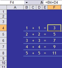
The formula for F4 looks fine, so why on earth does it show the wrong answer?
It's all to do with the difference between what Excel knows and what Excel shows. The figures above have had their decimal display adjusted so the display is rounded to the nearest whole number. In fact the data in B4 and D4 is 1.4 and in F4 Excel calculates 2.8
Whilst this may seem either stupid to do in the first place, obvious or generally something you don't need me to tell you about, problems can arise when, for example, dealing with money. You may well not notice that costs from some other calculations, rounded to the nearer penny, actually add up to a different total than the figure Excel shows as a total. Excel will add the exact figures (calculating up to 15 decimal places) and then round the total to the nearer penny - not necessarily the same thing. In an RSA OCR spreadsheet exam many years ago this occurred and only one out of hundreds of students spotted it and asked me what to do.
If you prefer to have 1 and 1 making 2, and totals of displayed figures adding up to the same figure as you'd get from good old mental arithmetic, counting on fingers or even an old calculator, then you'll need to tell Excel what you want.
There are three useful formulae:
=ROUND() does what Excel does naturally when you change the decimal display, rounding to the nearest number of digits indicated
=INT() may be more useful, displaying just the whole number
=TRUNC() is the best option, restricting the number stored to a chosen number of digits.
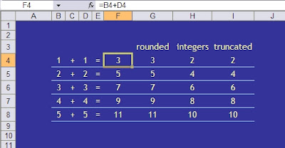
You could now, for example add up column H or I and get 30 using the usual sum formula. It is important to apply the formula at the right stage of a calculation but this might help avoid less obvious but potentially costly or embarrassing errors.
Office 2007 - where's the menu for this or that?
With acknowledgements again to Steve (trust me I'm a) Dr North at Agora, Microsoft have published some guides to help you figure out where to find the various tools that we all know exactly where to find in older versions of Word, Excel etc but can spend ages trying to find in Office 2007.
You can either access them directly on the Microsoft site or download them from there and use them off-line.
Word
Excel
PowerPoint
You can either access them directly on the Microsoft site or download them from there and use them off-line.
Word
Excel
PowerPoint
15 October 2007
search tricks in Google
Well, I wouldn't recommend that you do that exactly, what this is about are some of the words and terms you can use in the Google search box which have a special meaning. For example, you may know that define:kerning will produce web pages with definitions for what kerning means and that searching for "Andrew Hill" in inverted commas will find results for someone with that name whereas just typing Andrew Hill will yield lots of Andrews and lots of Hills but not necessarily joined together!
New ones I've learned that I like are:
book Just type book [space] title and that will search the text of a book with that title
what is (or what are) [space] something and that provides pages with an explanation of something
something site:www.thissite.com will provide results just from the site specified
You can also do calculations in the search box. Type 75% of 60 and you'll get the answer 45.
For a pretty good list of these and more the Google Cheat Sheet is worth bookmarking.
03 October 2007
Excel2007 makes mistakes!
Try multiplying 77.1 by 850 in Excel2007. Should be 65535. Microsoft seem to think it should be 100000. In fact any multiplication that should give an answer of either 65535 and 65536 goes wrong. Weird! I would be interested to know of any other odd 'answers'. Microsoft are to issue a patch for this particular one but who knows what others remain?
24 September 2007
Office 2007 Ultimate for £12.95
Now, as regular readers will know, I've been more than content with Office 97 for getting on for ten years. You get pretty familiar with software, for better or worse, when you've been wed to it for that long and I'm still finding things I didn't realise Word97 or Excel97 could do. It was such a huge relief too, after the hassles of teaching in a combination of Word6, 7 and 95. A mere £12.95, however, could get someone on a course with a .ac.uk e-mail address the full 2007 pack for a year or, probably the better deal, £39 for a full licence.
That's a remarkable figure. £39 vs £600 retail!
The offer's intended for students. The .ac.uk restriction will, unfortunately, exclude many and strikes me as a mistake as I know of many genuine students who are not provided with college e-mail accounts in these days of everyone having a perfectly adequate account of their own or using communication facilities within VLEs like moodle. Microsoft also state that the course should be at least 0.5 which I believe means requiring attendance, or study, for at least two and a half days a week during semesters or terms.
It's worth enrolling on something for that deal. Big Blue Brother reserves the right to check your entitlement and, for that sort of discount, I'm inclined the say that's reasonable enough.
Even if you can't figure a way to get eligible, do tell your students.
Here's the link to full details.
21 September 2007
Vista photo gallery for XP users

Microsoft included a nice photo gallery in Vista but that hasn't been enough to persuade me to leave the familiar and now pretty reliable XP environment. In fact Google's Picasa has been my application of choice for locating, previewing, simple editing and sharing the thousands of photos I've accumulated for several years now. The excellent team at Media Player development, though, seem to have had some input and helped create a pretty good gallery application for Microsoft and it may not be generally appreciated that you can have the Vista-style gallery on your XP operating system.
Access the beta version here. Beware of the other bits and pieces that they try and get you to install at the same time. Their blog writer may be worth playing with (I'll give that a try and report separately) but you're unlikely to want Windows Live as your default search engine and certainly won't want your default home page changed to whatever they offer.
Thanks to Dr Steve North, of Windows Adviser fame, for this tip.
13 September 2007
Excel hyperlink color colours
There I was, actually doing something to get a bit more organised at the start of term in the shape of a timetable for my teaching when I hit a problem that had me scratching my head. Finished up having to look on various forums to get the answer so here's the problem and the solution which may save you a few hours one day!
For some reason best known to me I had used blue blocks for various lessons with white text. To make life simple I put hyperlinks on the text so that clicking a lesson would take me to the appropriate register. Of course, the text turns blue and gets underlined and is virtually invisible. Or it goes purple as a 'visited' link.

Ok, that'll be easy to fix, I say to myself. Uh-uh. Tried almost every menu. Tried the Microsoft help files but I seldom get much joy there anyway. Thought about the PCAdvisor forums but they don't have an obvious Excel place. Normally I would have popped into Woody's Lounge but that's under some redevelopment and temporarily off-line. Eventually I find Vastly Important Notes blog by Phil Libin and get the answer. Another addition to my favourites list.
You need Format | Styles and there you can change Hyperlink and Followed Hyperlink colours (or colors in MS speak).

That's better!
12 July 2007
An Englishman abroad?
Just noticed how widespread all you people are - OK Britain still has the biggest blob and USA the highest number but lots of you have been coming from all sorts of other interesting places. Now, I'm on holiday for a month or two . . . so, come on, tell me where you are and why I should or shouldn't head in that direction over the summer. Leave a message on skype|: andrewx.com or e-mail me.
How do you do?

This may not work but it's worth a try. I've created a StudyZone page where you can post your own questions, preferably about things to do with ICT.
You may not get any answers but, there again, you may. Who knows. You won't know until you try.
Here's the link. I've used a pbwiki page as they're pretty cool and do what I want them to, generally.
http://studyzone.pbwiki.com/HowDoI
Look! I've got 43 slides in my presentation . . .
. . . and you wonder why people look bored before you've even started! I keep saying this but still find loads of people who really should know better starting off their presentations by opening PowerPoint and there, laid bare before us all, is this display of n slides (where n is usually a very large number!)
Even if you've got this cool show organised and even if the slides themselves have a nice design and combination of text and images that aren't distorted, your audience will be thinking about the other 42, 41, 40, 39 and doze off for a while.
Don't do this!! Put the show together and then save it as a PowerPoint show. It's dead easy. You then get a .pps file which you can stick on the desktop or wherever. Open that when you're ready and Zapp! The first slide appears, full screen, with no clue to the tedium to follow.
It's been that time of year again when everyone gets staff-developed. Yawn. I was amazed to see so little improvement in presenters' skills after all this time but there again, none of them had turned up to my sessions this year. Probably the worst offender was one PowerPoint slide that had a large but very fuzzy image of something to do with College. It was obviously an image nicked from Google images but looked as though they had just found the image and copied the small version and pasted it in. Next time - get the real, proper size image from the site, save it and add it to the slide. And do check the size. If you have to stretch it afterwards then you need a bigger, better quality image in the first place and, frankly, Google images isn't the place to get them anyway.
If people put a bit more effort into the slide preparation then what they've got to say would usually get listened to a lot more.
08 May 2007
Why do you want to use PowerPoint?
Some notes on using PowerPoint are now available, with illustrations from an XP2003 version, probably the most used at the moment and with significant differences from the old 97 style notes. Of course now I'll start getting requests for 2007 which I haven't even seen myself yet. Anyway the complete set and some tasks will be released via the Studyzone wiki as an experiment. I'll also publish them on either a site or a blog too but, at 22 pages, that's not as easy as it sounds! here's the first page, though. The rest at this link.
- Presenting information as you might have done with OHTs in the old days
- Supporting a speech or lecture – bullet points reminding you of what to say
- Displaying images in a big way
- A slide show (literally)
- A simple way to create graphics
- Plan what you want to put on the slides (which will be different to, and much less than, what you want to say!)Start, end and middle etc. Find the images you might need and save them somewhere. If you intend to use links to web sites, store them as Favourites or Bookmarks
- Use the defaults. Leave the fonts alone. Type where suggested. Ignore all the designs and groovy backgrounds (at least until the content is finished)
- Use supplied slide layouts. Don’t add your own text areas to a blank slide unless all your doing is a picture show.
- Use a Master slide for anything that needs to appear on every slide (like a corporate logo, name, date etc.
05 May 2007
When's a good time to . . .
Biorythms. Hmmm. Maybe you think they're a load of nonsense and will immediate scroll off somewhere else or wonder why on earth I'm taking so long to come up with those PowerPoint notes. If you're still here, Google have a nice little gadget that can sit on your desktop and indicates when your emotional senses, physical state or intelligence might be at a peak or trough, based on the assumption that each varies over time in a sine wave fashion. If nothing else, it might help explain why some days are just plain lousy!
Get it here
You can also see at a glance how old you are. You can also do that in Excel quite simply.
Type you date of birth in cell A1. In another cell type =NOW()-A1. That'll give you a funny date. Use Format|Cell to change the display to a Number, General to get the number of days.
Get it here
You can also see at a glance how old you are. You can also do that in Excel quite simply.
Type you date of birth in cell A1. In another cell type =NOW()-A1. That'll give you a funny date. Use Format|Cell to change the display to a Number, General to get the number of days.
20 April 2007
Ads and things
So that I can find out a bit more about how a variety of things that can be added to web logs work you may see all sorts of odd extra panels appear in the sidebar. Can't really advise people on these sort of things until I've tried them out myself. One will be Google's AdSense programme which will include ads., hopefully not plastered across the page or flashing annoyingly at visitors. I need to see what sort of content appears and how the adminstration works. Obviously, as I have no idea what products or services will appear, I cannot endorse any of them. To be honest, the similar stuff I've seen on other blogs or sites always looks a bit sad and I can't imagine how anyone makes any money out of this but I get so many questions about this I can't answer I need to collect some facts myself.
PowerPoint notes
With so much new stuff around these days it can be very easy to forget that sitting on most people's desktops is the excellent Microsoft PowerPoint. I've just been asked to run some sessions, some for people who've never used it before and some for those who would like to use some of the more advanced features. Of course, the people I'd really like to see are those who think they're good at presentations but aren't and those who just need to know how to speak in public! Anyway, watch this space as I'll be making the new notes available here soon.
16 April 2007
Vista? wait a while and tweak XP this year
Vista does look pretty with some nice work on liquid rollovers and clever use of transparency and the higher-end versions have some smart visual features but, having recently watched a not inexperienced colleague struggle with a whole host of previously straightforward tasks there would seem to be much sense in waiting for some fixes from Microsoft and for key applications to be fully compatible.
While you're waiting, there are some extras you can get for XP called Powertoys. Created by Microsoft staff, but not officially supported by the company, they can add some interesting features and TweakUI has utilities to help change otherwise impenetrable parts of the operating system code. Choose what you'd like to try here.
You could also impress anyone passing your desk by installing a free 3D Windows logo screensaver, available here.
04 April 2007
Web tools
Just completed a major revision of the Webtools site. This has links to all sorts of free wonders and links to a pbwiki site where people can leave comments on useful some might be. Cheekily, I suppose, I included this blog but it is free and it is an example of quite a few of the tools mentioned. You'll find technorati, del.icio.us and wink bookmarking tools in the left panel, for example. Only slightly odd people like me would need more than one but any one can be a great way to store sets of bookmarks or share developments on a particular theme. Must remember to tag this post . . .
29 March 2007
What time is it?
Just wondered whether the US-based Blogger know about UK habits regarding twirling the hands on a clock or consulting manuals in drawers to figure out how to change equipment time displays each March and September.
04 March 2007
Making simple charts in Word
Say data and charts and the word spreadsheet comes to mind. Microsoft Excel's what you'd normally use but the word Word shouldn't be ignored. Microsoft Word has a chart facility that actually uses most of its brother application's tools and even has its own formula feature for calculations.
The simplest way to use both the formulae and charts is to put your data in a table. With a bit of care about how you set it out, and make sure you don't leave any blank rows or columns, the steps below will guide you through the process for doing some column totals, sorting the data into a different order and displaying it as a bar chart.
The simplest way to use both the formulae and charts is to put your data in a table. With a bit of care about how you set it out, and make sure you don't leave any blank rows or columns, the steps below will guide you through the process for doing some column totals, sorting the data into a different order and displaying it as a bar chart.
1 Insert a table
2 Put some headings in top row
3 Enter your data (tip: use the tab key to move which will also add rows if necessary)
4 Add an extra row for totals

5 If it’s not already showing, get the Tables and Borders toolbar, View>Toolbars>Tables and Borders or click the Tables and Borders icon on the main menu bar.

6 Click in the cell where you want the numbers above totalled and then click on the Σ key on the T&B toolbar

7 Repeat as necessary for other columns (check that it looks about right!)
8 To sort data in A-Z or 1,2,3 order of the first column, highlight what you want to re-arrange, including all the columns but not the headings or totals

9 Press the AZ or ZA button on the T&B toolbar
10 To sort in order for another column, eg by Maths results, you need to use Table>Sort and choose what you want in the window that opens. Again, it’s usually necessary to highlight all the data you want sorted (as in the previous example)


11 To make a chart, highlight the data to be included in the chart. In this case that will include the headings this time but not the totals.

12 If there isn’t an Insert Chart icon on the toolbar, use Insert>Picture>Chart

13 The default chart is a 3D column chart which will often be what you want

14 Use the corner handle to drag it out as necessary. To move it down, click on the chart, press the left arrow key and then enter to make new lines above it.
15 Enter a heading to describe what the chart shows

16 to edit the chart, double click on it. A data table will appear and you can also change almost every part of the chart.

17 If you wish to change the order of things displayed in the chart you have to re-arrange them in the datasheet that opens, not the original table. (If you do change the original table you will need to make a new chart as there is no link between the table and the chart in Word.)

18 It is usually a good idea to have labels on the axes to say what the units or categories are – there aren’t any in this example.
Note: Microsoft must have some deal with printing ink suppliers because all their default charts, and those in Excel, have grey shaded backgrounds. Totally unecessary - indeed, they make what can be a boring subject for some look even more tedious! Get rid of them. It's called the plot area and, once selected, can be changed. No fill is a good bet or, if you must have a background, you can choose from almost anything you want, including pictures. There are some more notes of that here.
28 February 2007
London, because it's the least inconvenient . . . ?
Ten people trying to decide where to meet. Everyone has a good reason for not wanting to go somewhere as well as their own preferences. How do you decide? The boss says "London, because it's the least inconvenient" and he may well be right but it would be nice to see it in writing. Rather foolishly, I thought it would be easy to knock up a spreadsheet that would add up people's votes and work out what was actually the most popular, least inconvenient or whatever. Partly because I decided to include all sorts of checking things, validation and partly because I'd never used =AND before, it took ages!
No doubt the meeting's been arranged in London by now and it really needs to work on the web to do what I wanted but maybe all the effort will be of use to someone teaching Excel or trying to figure out some formulae. The sheet's protected but there's no password. Let me know if you use it, have a better idea or spot errors.
It's a small file that you can get here. There's an on-line version that actually seems to work using Google spreadsheets. Amazing! As I might really use this I'll just give the team the address for now but will release the link genrally soon.
27 February 2007
What colour's face07?
Something for web designers. Often you'll need to specify a colour for something in a string of 6 characters. ffffff is white, for example. Ypou know the colour you want but what on earth is the code? Download a great little free tool from ColourSchemer and it does the job for you. Brilliant!
24 February 2007
Internet Explorer 7 update
Finally got round to adding some images to the notes. Blogger need to add a few tools to make image handling a bit easier, though, and it seems impossible to place them as in-line images that sit where I want them. Big pictures seem OK but not little ones so I may still finish up doing these notes as a Studyzone page and linking to it! Still, hope they're useful to someone.
12 February 2007
putting an image in a web log header
The new version of Blogger provides lots of fairly user-friendly ways to change the way a template looks (more about that in my Q4 notes) but getting an image, or replacing one, in the header area is a bit trickier. Because it involves putting one of your own images on a web site this may prevent many people attempting it but for those who think they can manage that bit, here's what to do:
1 Find out the size of the existing image. Firefox browser users with the Web Developer toolbar will find this easy. IE users could try right clicking on the image and looking at its properties. These notes are based on the Rounders3 template used for Q2 News and others and the image size is 740x150.
2 Choose an image that contains a section of this size that you'd like to use. You might get away with re-sizing a smaller image but it's better to start with something larger.
3 In an image editing program crop a section 740x150 out of the image. In many applications you can set the size of the area to be cropped and then drag the rectangle around to see what the extracted part will look like - useful as it's an unusual size that you're working with an large images may offer all sorts of unexpected possibilities.
4 Save the extracted bit as a separate file in any of gif, jpg or png formats, whichever is the most suitable combination of quality and file size. Avoid exceeding 30 or 40KB if you don't wish to annoy visitors on slower connections. Most image editors will have an 'Export' facility to help here.
5 Upload that image to the web somewhere. It doesn't need to be on a web page but if that's the only way you can do it that's OK. Although I haven't tried it, I guess putting it on a Flickr or Google-Picasa album page might work too.
6 Note the url of the image on-line. I put mine on my andrewx.com site so the address is something like http://andrewx.com/leaves5.jpg which is quite simple but you may have to go to the web site and right click on the image to get its url, then copy that to the clipboard.
7 From your Blogger Dashboard, go to settings and in the Template tab click Edit HTML.
8 Even I find some of the code pretty impenetrable but somewhere in there will be the instructions for where the page is to get its header. In one of my web logs it looks like this:
#header {
background:url("http://andrewx.com/butterfly5.jpg") no-repeat left bottom;
padding:0 15px 8px;
}
9 Well, it looked a bit different becuase it had a different url in the brackets! You'll get the idea, though - that url is what you should paste or type in (don't put any extra spaces or pubctuation).
10 Save the changes and see if it's worked.
I hope it did. I haven't got round to changing the header on this blog, which uses a different screen wide layout. It may be that some extra instructions will be necessary which I'll publish if I ever get time to try this one.
10 February 2007
Radios, clocks and counters
OK so this is not one of those essential features but while I was trying to find the illustrations for the IE7 article I came across some excellent little things. First there's the radio. This comes from labpixies and can easily be added to your web log, Pageflakes site or almost any other site for that matter.
Just copy the few lines of code from the labpixies site, go to your Blogger dashboard and click on settings. Add an element and choose a HTML/Javascript panel. Paste the code into the box. That's it. The radio should appear. Click on the little curly arrow for settings which takes you to the list of radio stations and set your own choice for each of the five knobs.
Have to say I feel quite good about being the one who added Radio London to their list tonight! My No. 1 station, of course, but if you want Cricket reports from India you can probably get them too.
The clock's been around for a while on several of my sites and web logs. That's from clocklink.com where there's a range to choose from. Again, choose your clock, set the time zone and copy the code. Use another HTML/Javascript panel and paste it in.
Last one's a hit counter. These are more than just the vanity meters and can be a useful guide to things like what browsers or screen resolution visitors have which can influence the way you display site pages. And if you find that all your visitors are coming from Chnia then they might appreciate a welcome message in their language. I'll explain how to do that in another post! There are lots of hit counters out there but I find sitemeter one of the simplest and the free version comes with plenty of stats for my purposes. You need to register on the site but that's pretty harmless if you can avoid ticking any newsletter boxes. Then choose a style, background, font colour etc. You don't need to wait for the activation e-mail - that is just to enable you to manage the counter later for which you'll need the user ID and password they send - you may as well get the code while you're there and paste it into another box like the ones above. Do remember to select the option that doesn't count repeat visits from your own computer.
For those of you who can do 'proper' sites then the code just goes into an appropriate section of your page where you want the display to appear. Most editors will enable you to get at the code to do this and you'll probably know all about this so I won't go on any more. This was mainly for those who would like to personalise their web logs. Google have really opened their templates up but some bits are still not as obvious as they could be.
14 January 2007
anti-virus software
Sometime ago I wrote elsewhere about the internet go-slow experienced after installing McAfee Security Centre. Things did improve but I still find that when it's scanning everything slows still and that seems to take an age to complete. I guess I could schedule that for another time but I'm not inclined to leave the computer running all night so, when it's on it's on because I want to use it. I have also got fed up with being greeted every day with the Big Brother messages that I am not protected just because I don't use their spamkiller or privacy tools. I finally decided to get rid of it completely and have installed the free Avast! software which doesn't seem to interfere with my activity anything like as much. SpamButcher continues to do a good job with spam which has risen to several hundred a day and Thunderbird spots what it does let through.
On the very first scan Avast! found Win32:small-AMI, a trojan, lurking in some music software I'd had for a year. That was very satisfying (and might explain the hefty spam). Windows own firewall seems to do its job so thanks for the ride McAfee but, for now, it's farewell and here's to decent speed surfing again.
On the very first scan Avast! found Win32:small-AMI, a trojan, lurking in some music software I'd had for a year. That was very satisfying (and might explain the hefty spam). Windows own firewall seems to do its job so thanks for the ride McAfee but, for now, it's farewell and here's to decent speed surfing again.
Even smarter photo albums
Something lots of people ask about and which I have wanted to do better for a long time is an on-line photo album. Serif has a reasonable tool in their PhotoPlus package but it's looking dated now and is difficult to edit. I tried a variety of others produced by a search but none was either smart or simple enough and for my own galleries and a huge gallery I made for a photographer friend I resorted to doing it all page by page! Then CoffeeCup came along with quite a nice tool which also has some fun features. It's not free, though, and still can appear a little gimmicky. Now I've found JAlbum's excellent software and it seems to answer all my prayers. And it's free! It's been around for years but the latest version is much improved. I'll add a link to a sample as soon as I publish one.
I have also promoted both Frappr and Google-Picasa in various publications. These still have the advantage of being stunningly simple and ideal for those who have no idea about how to upload to or access web space but I'll be using JAlbum from now until something else comes along.
I have also promoted both Frappr and Google-Picasa in various publications. These still have the advantage of being stunningly simple and ideal for those who have no idea about how to upload to or access web space but I'll be using JAlbum from now until something else comes along.
10 January 2007
IE7: where have all my toolbars gone?
Microsoft's Internet Explorer 7 is a great design improvement on earlier efforts and, whilst I still prefer Firefox, there are some useful new features like tabbed browsing (which Firefox has had for ages) and a simple zoom feature (which Firefox doesn't have) that narrow the gap between the two. It does look a bit different, though, to its predecessor, and default installations may hide some of the things that you have been familiar with. So here's a quick guide to displaying some toolbars and what some of the new buttons do.
 The first thing you may want to do is get the Menu bar back. Click on the Tools button and select Menu bar.
You may find that you cannot move any of the toolbars. Under Tools, click on Toolbars and then on Lock the Toolbars if that is checked. While you're there you can restore a Links toolbar by clicking on that entry.

If the toolbars are locked the Links toolbar will only be displayed at the right edge with a chevron to click to access the links themselves. Unlocking will allow you to drag the Links toolbar across to the left to display as many link names as will fit which is usually more useful.

To add Links here, by the way, you go to the page required, click Favourites Add to Favourites and then select the Links folder to store them in. The contents of that folder are what get displayed. None of the other folders, or just Favourites generally, will feature in a bar like that, just Links which is a bit special. Sometimes that folder is stuffed with Microsoft links which you really don't need. Right click on these and delete them. No big loss. (None of this is different to IE6 or previous but thought I'd remind you).
Links and menu bar restored and now movable, you can play with some of the new toys.
The big new thing is the little square button, or tab, to the right of the one with the open page name. Click on that and you get a new window, probably with a helpful note from Microsoft on the subject. Put an address in the address bar and that will appear - but the other page doesn't disappear as it used to. It stays on its tab. You can have lots of tabs open as each time you open a new one a little square tab appears to its right (although that can be changed if you really want).

If you do have several tabs then try the four square button to the left of the row of tabs. Nice, isn't it? You get an attractive but maybe only marginally useful set of mini pages laid out on the page. Some people really like this and it does have an initial Wow factor, I suppose.
Links and menu bar restored and now movable, you can play with some of the new toys.

The big new thing is the little square button, or tab, to the right of the one with the open page name. Click on that and you get a new window, probably with a helpful note from Microsoft on the subject. Put an address in the address bar and that will appear - but the other page doesn't disappear as it used to. It stays on its tab. You can have lots of tabs open as each time you open a new one a little square tab appears to its right (although that can be changed if you really want).

If you do have several tabs then try the four square button to the left of the row of tabs. Nice, isn't it? You get an attractive but maybe only marginally useful set of mini pages laid out on the page. Some people really like this and it does have an initial Wow factor, I suppose.

Top right is the built in search which Microsoft, being Microsoft, set to their Microsoft Live search facility. You'll want Google, or one of many others maybe. Click on the little arrow next to the magnifying glass and then on Find more providers.


This takes you to a web page featuring a range of search engines and you simply choose the ones you want to add and then set the one you like best as your default.

Bottom right is a nice zoom tool. It works simply and most effectively and will be a boon to those who find text too small or just want to get a closer look.
Nothing in these notes will be new to the experts out there but they may help those to whom it all looked a bit confusing. I'll write about some of the more advanced tweaks later.
Images to follow for this post.
Subscribe to:
Posts (Atom)